











Vehicle imagery is an awkward image class for compression: photographic gradients across curved paint, razor-sharp cut-out edges, and an alpha channel that has to survive intact wherever the car gets composited onto a custom background. General web-image advice mostly transfers, but the edge cases are exactly where car images live. Here is the format decision, made properly once.
The three formats in practice
| PNG | WebP | AVIF | |
|---|---|---|---|
| Transparency | Lossless alpha | Alpha, lossy or lossless | Alpha supported |
| File size (typical cutout) | Largest by far | Small | Smallest |
| Edge fidelity | Perfect | Very good at sane quality | Very good, slower to encode |
| Support | Universal | Universal in practice | Modern browsers |
| Best for | Print, compositing pipelines | Everything on the web | Bandwidth-critical, if served |
Where each one wins
PNG: the archival and compositing format
PNG earns its bytes exactly twice: when the image enters a print or design pipeline that will recompress it anyway, and when downstream compositing needs a mathematically clean alpha channel. As a delivery format for web pages it is a habit, not a decision. It is often five times the transfer for no visible difference.
WebP: the default
WebP with an alpha channel at reasonable quality is the workhorse: transparent cutouts at a fraction of PNG weight, universal browser support, and quality controllable per request. For a listings grid or a VDP gallery, format=webp with an explicit width is the whole policy.
AVIF: sharper pencil, same drawing
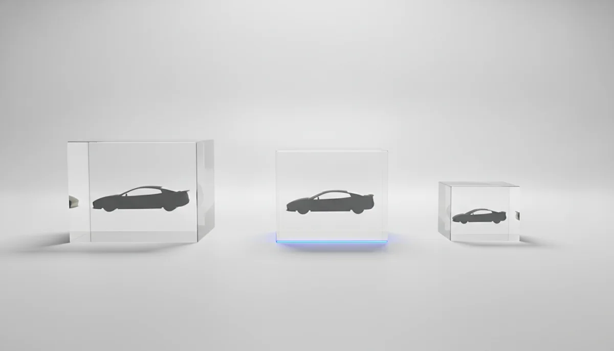
AVIF compresses harder than WebP at equivalent quality and its support story is now good. The honest question is marginal gain: on properly sized vehicle cutouts the step from PNG to WebP is dramatic, the step from WebP to AVIF is a trim. Check /api/options for the formats currently served before building a pipeline around one.
The mistakes that outweigh the format choice
- Serving full-resolution images into small slots. Width parameters exist, use them
- Shipping PNG transparency to a page that puts the car on a white background anyway
- Recompressing an already-lossy image in your own pipeline, stacking artefacts on cut edges
- Ignoring quality parameters: vehicle renders survive compression well, and default-quality-everything leaves easy bytes on the table
Format choice is worth one meeting. Sizing discipline is worth one meeting a quarter, forever.
A worked example
Take a listings grid rendering 48 vehicle cards. As full-size PNGs the page ships tens of megabytes of imagery, which mobile users on cellular connections simply do not finish loading. The same grid at a 600 pixel width in WebP typically lands two orders of magnitude smaller per image. Nothing about the design changed, and the grid went from unusable to instant on the connection most shoppers actually have.
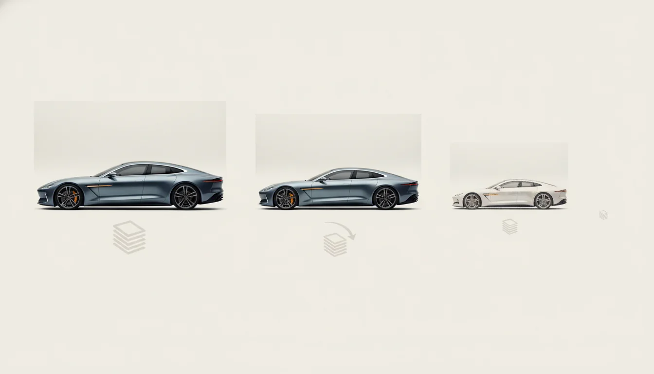
Pair the format choice with srcset and the browser does the rest of the work: small screens pull the small variant, retina screens pull the sharp one, and nobody downloads pixels they cannot see. Since dimensions are request parameters, the whole responsive setup is three URLs that differ by one number.
What transparency and shadow variants are for, and how they combine, is covered on shadows, reflections and transparency; delivery parameters live in the API documentation.